
SDKs
SDK - UI Customization
Customize the PayOrc Flutter SDK payment UI — colors, input styles, and app bar appearance.
SDK - UI Customization
1. Overview
The PayOrc Flutter SDK provides a customization API that allows merchants to tailor the look and feel of the payment UI to match their brand identity.
You can configure colors, input styles, and app bar appearance to ensure a seamless user experience within your application.
2. Visual Reference
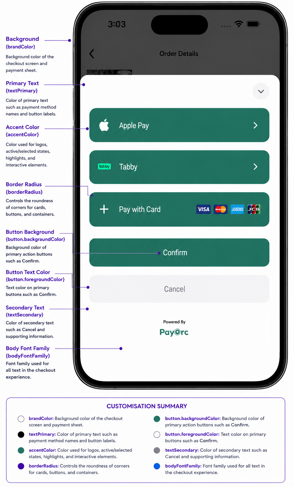
Checkout Modal
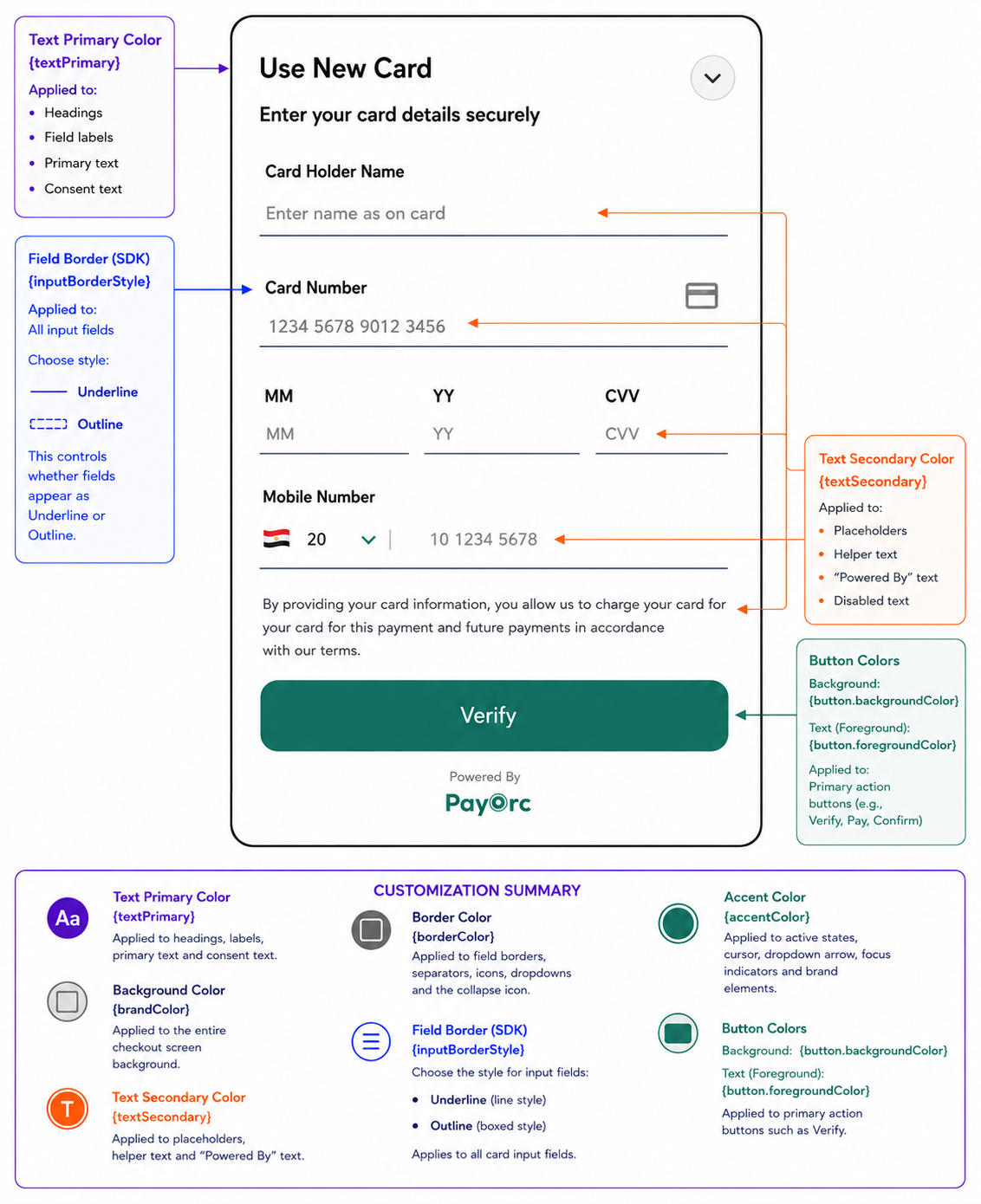
Card Entry Form
3. Usage
Initialize customization before invoking any payment or card-related flows.
PayorcSdk.customization(
  inputBorderStyle: PayorcInputBorderStyle.outline,
  brandColor: "#000000",
  buttonColor: "#000000",
  accentColor: "#000000",
  appBarStyle: AppBarStyle.nativeIos,
);
4. Parameters
| Field | Type | Required | Description |
|---|---|---|---|
| inputBorderStyle | Enum | No | Defines input field style (outline, underline). |
| brandColor | String | No | Primary brand color in HEX format. |
| buttonColor | String | No | Color for primary action buttons. |
| accentColor | String | No | Accent color for highlights and focus states. |
| appBarStyle | Enum | No | App bar style (nativeIos, nativeAndroid). |
5. Parameter Details
inputBorderStyle
- outline — Bordered input fields
- underline — Minimal underline style
brandColor
Primary color used across the SDK UI (Background color).
buttonColor
Used for call-to-action buttons such as Pay / Submit / Confirm.
accentColor
Used for focus states, active elements, and UI highlights.
appBarStyle
- nativeIos — iOS-style navigation bar
- nativeAndroid — Android Material design style
6. Example
PayorcSdk.customization(
  inputBorderStyle: PayorcInputBorderStyle.outline,
  brandColor: "#1A73E8",
  buttonColor: "#34A853",
  accentColor: "#FBBC05",
  appBarStyle: AppBarStyle.nativeAndroid,
);
7. Color Examples
Light Theme
PayorcSdk.customization(
  inputBorderStyle: PayorcInputBorderStyle.outline,
  brandColor: "#FFFFFF",
  buttonColor: "#1A73E8",
  accentColor: "#1A73E8",
  appBarStyle: AppBarStyle.nativeIos,
);
Dark Theme
PayorcSdk.customization(
  inputBorderStyle: PayorcInputBorderStyle.outline,
  brandColor: "#121212",
  buttonColor: "#BB86FC",
  accentColor: "#03DAC6",
  appBarStyle: AppBarStyle.nativeAndroid,
);
8. Best Practices
- Call before payment flows — Initialize customization before invoking
addCardorsubmitOrder. - Use HEX format — Always pass colors as HEX strings (e.g.,
"#FF0000"). - Match your brand — Use your primary brand color for
brandColorand accent for highlights. - Test both platforms — Verify the UI looks correct on both iOS and Android with different
appBarStylesettings.
Related Pages
- Add Card (Tokenization) — Tokenize customer cards securely
- Payment with Token — Process payments using saved tokens